The Game Seven Podcast
-
The Game Seven Podcast breaks down the latest NBA buzz and historical moments. I created a sharp, symmetrical brand identity that captures basketball's energy through bold typography, balanced layouts, and a warm-cool color palette.
-
Brand Identity Design, Podcast Branding, Logo Design, Social Media Templates, Merchandise Design
-
Brand strategy, logo design, visual identity system, typography selection, color palette development, touchpoint design across digital and print
-
Adobe Illustrator, Adobe Photoshop, Adobe InDesign

Brand Identity
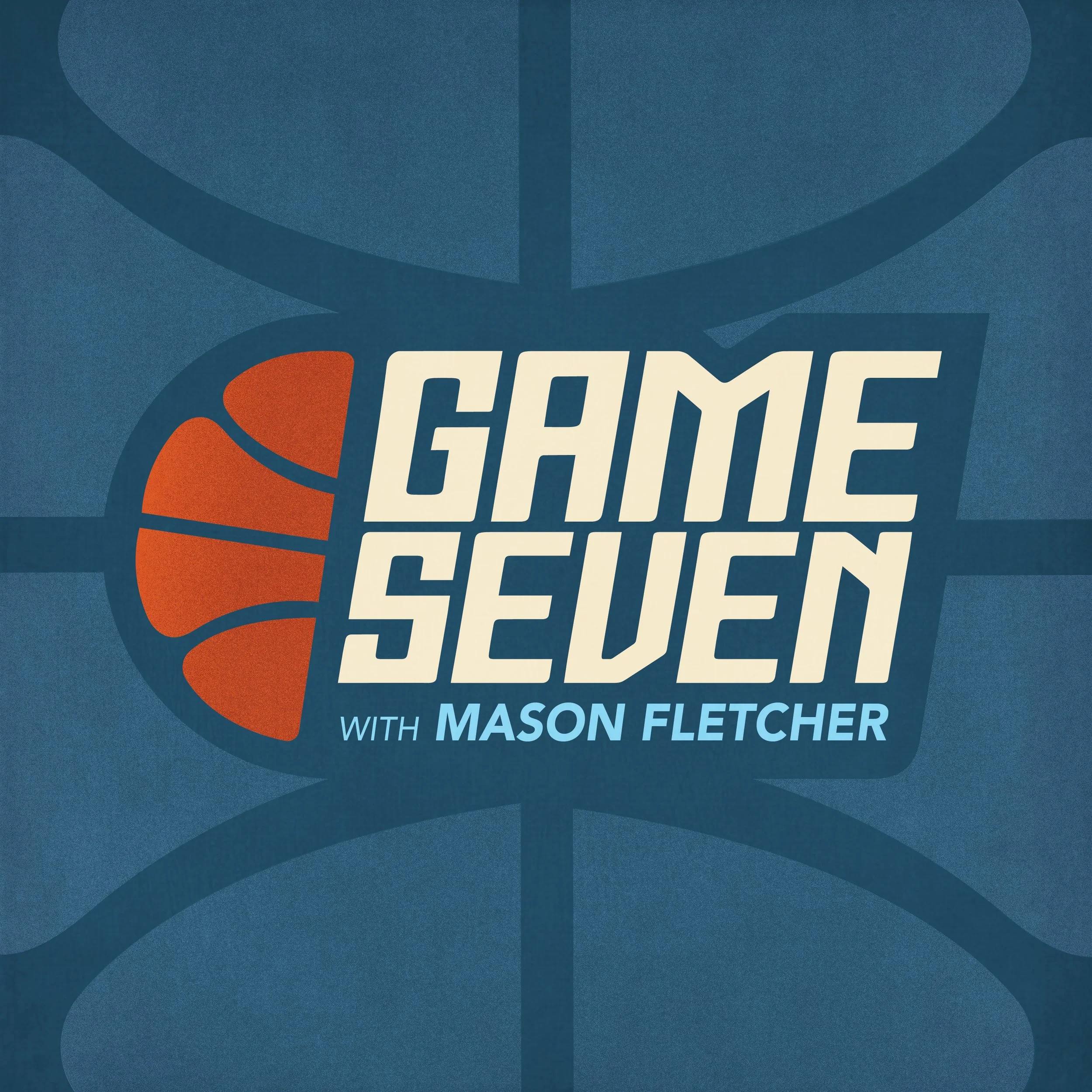
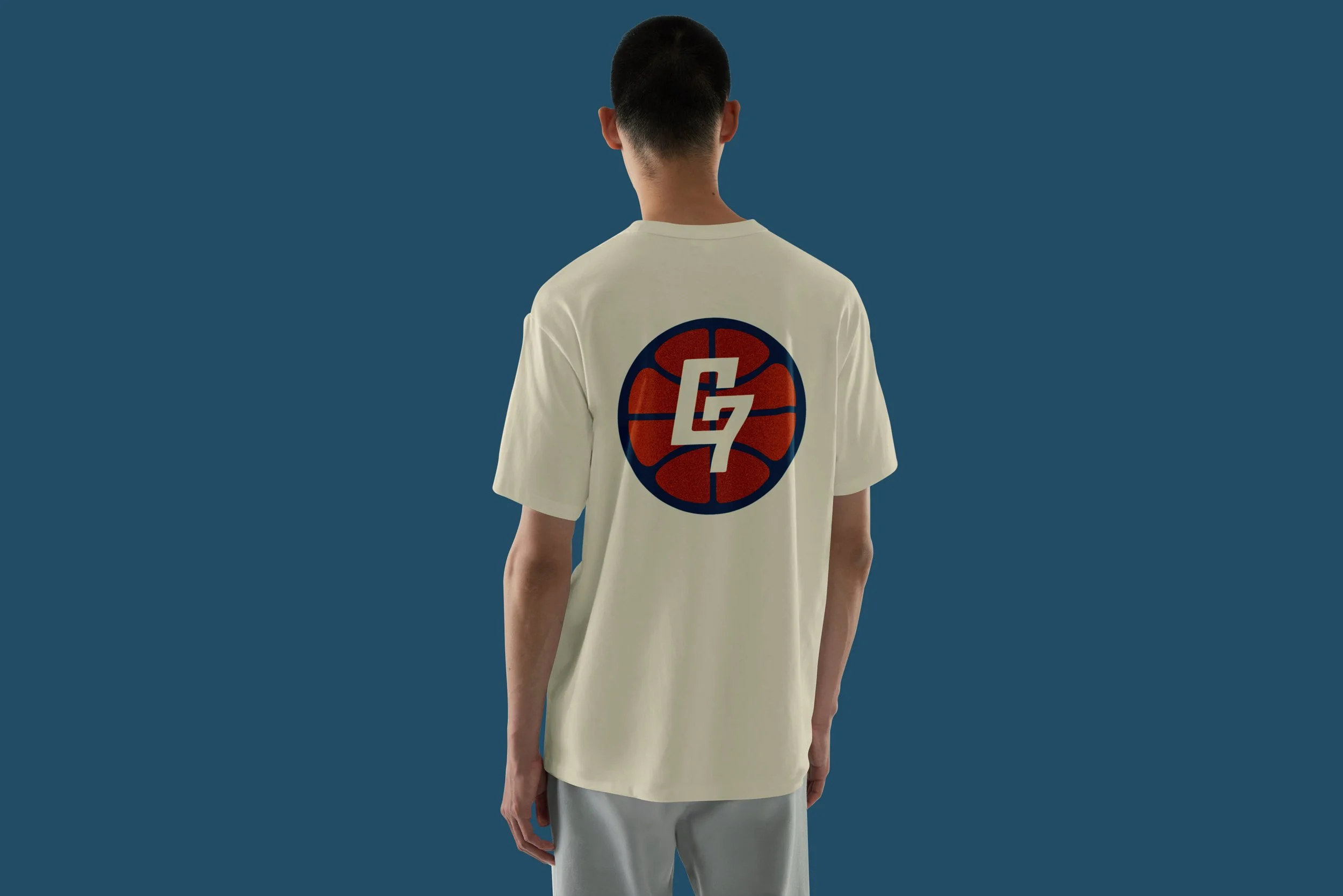
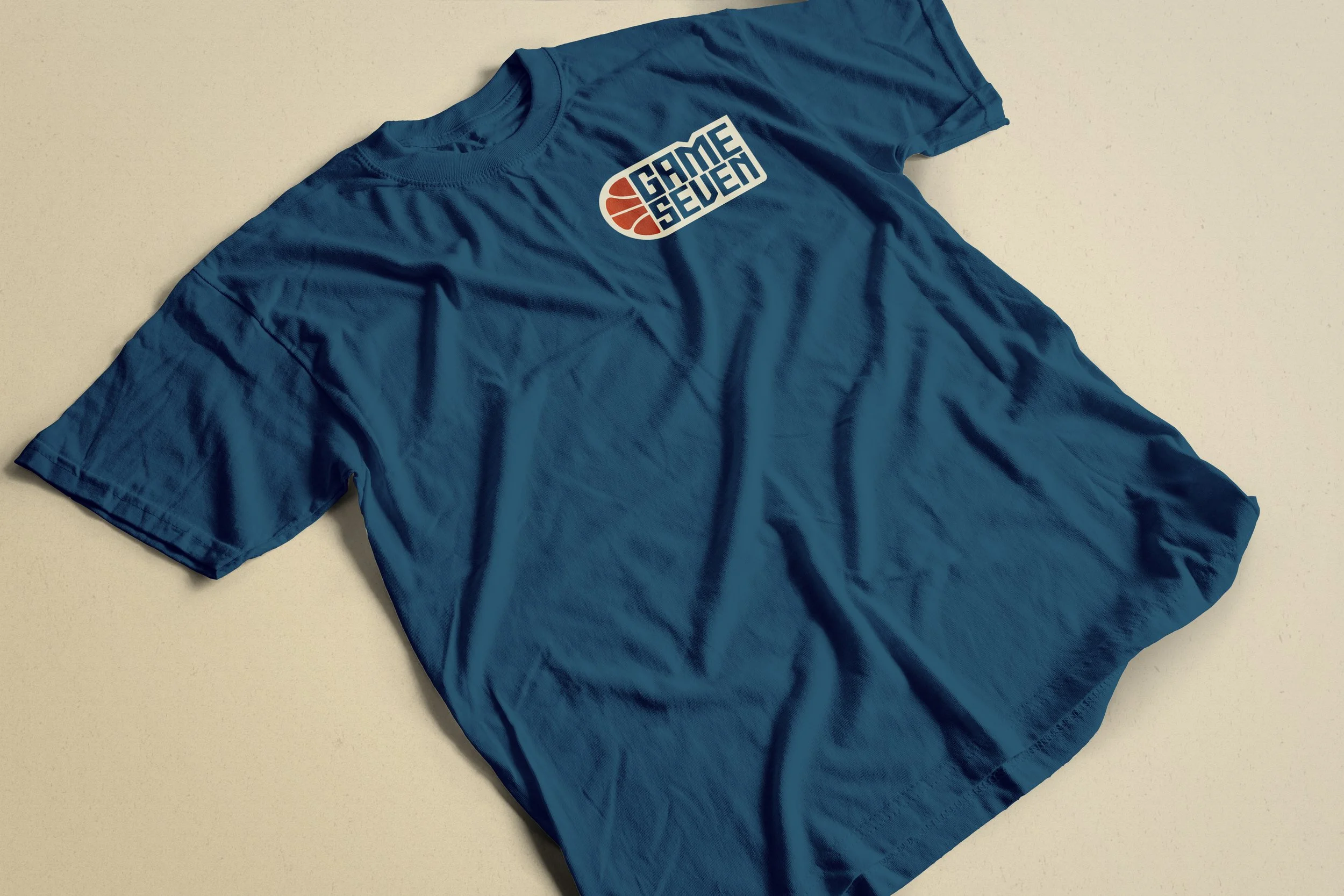
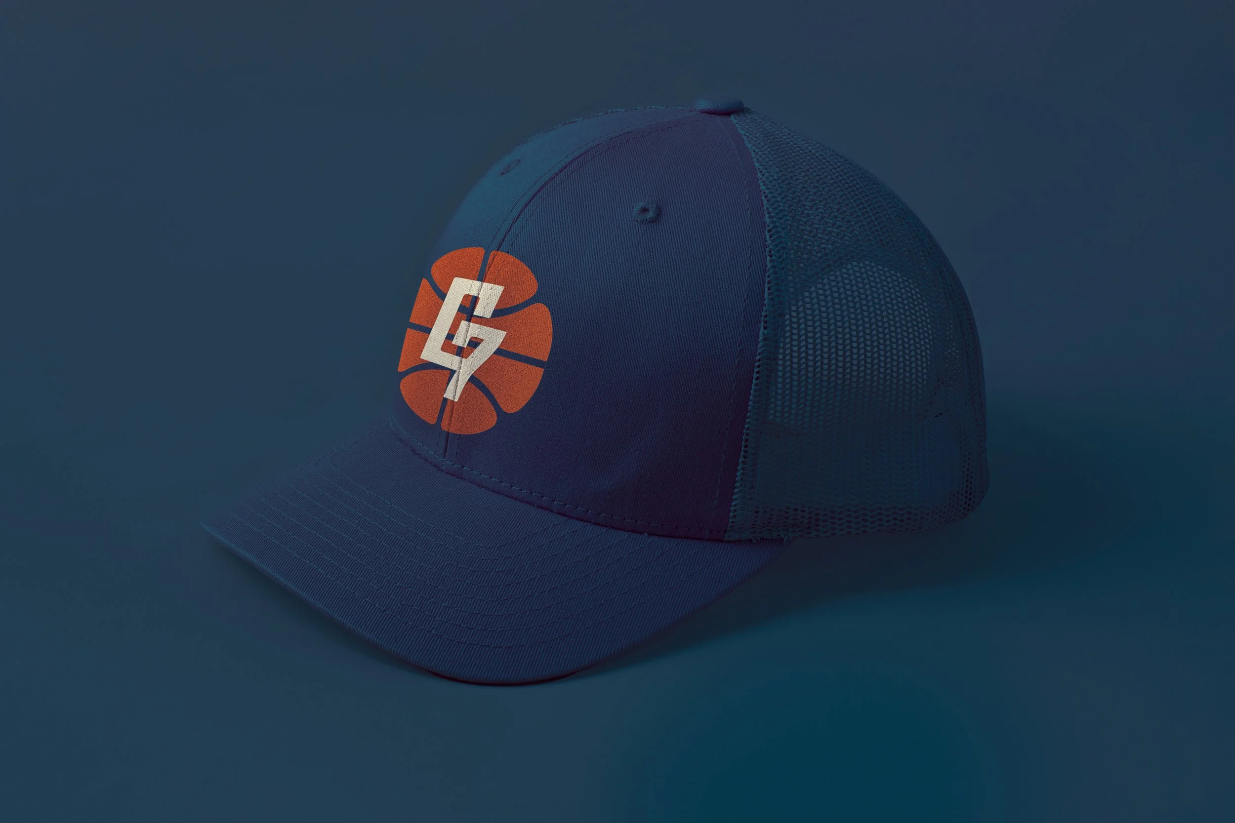
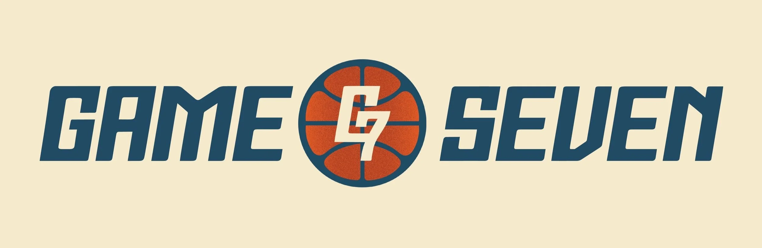
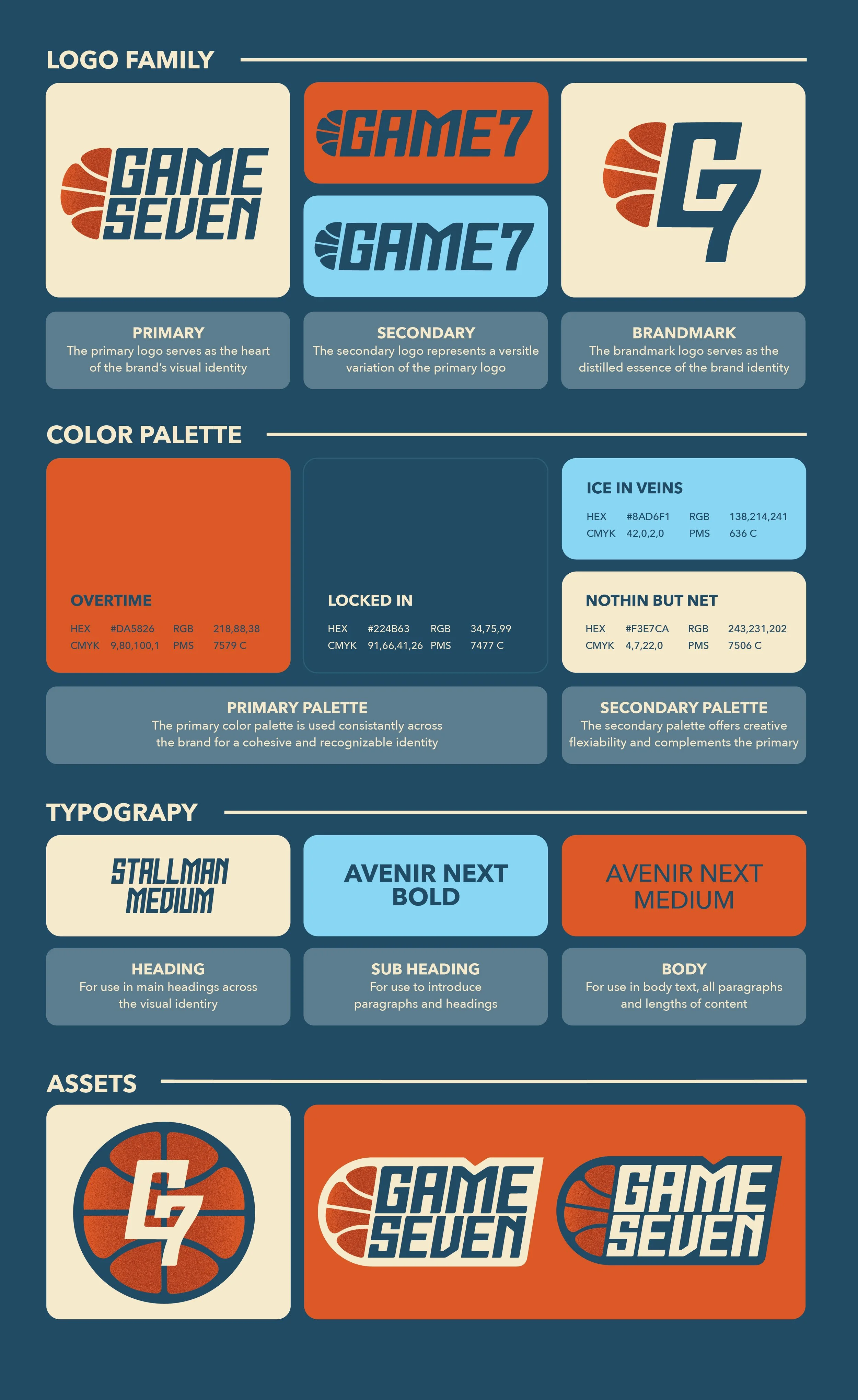
The Game Seven Podcast’s brand identity balances sharpness and warmth, creating an inviting yet bold visual experience. The logo features crisp, symmetrical typography, with sharp edges symbolizing precision and focus. The design mirrors the symmetry of basketball courts and the structured dynamics of the game, reinforcing the podcast’s credibility.
The color palette pays tribute to the sport with Burnt Orange (“Over Time”) representing the classic basketball hue, Dark Teal (“Locked In”) for focus, Baby Blue (“Ice in Veins”) for coolness under pressure, and Cream White (“Nothin' but Net”) to smooth it all together. These tones offer contrast and energy while giving the brand a basketball-inspired charm.
Podcast Cover Art
The cover art incorporates brand identity elements, zooming in on the basketball logo to double as a basketball court, enhancing the sense of symmetry and maintaining a clean, effective look across platforms.