Thirteen Skate Co.
-
Thirteen Skate Co. is a concept brand that challenges superstition by empowering the number thirteen as a symbol of resilience, creativity and limitless potential in skate culture. I developed a complete brand identity that flips the script on luck, creating bold graphics across logo design, skateboard decks, apparel and branded merchandise.
-
Brand Identity Design, Logo Design, Apparel Design, Packaging Design, Branded Merchandise
-
Brand strategy, logo design, visual identity system, deck graphics, merchandise design, packaging concepts
-
Adobe Illustrator, Adobe Photoshop, Adobe InDesign

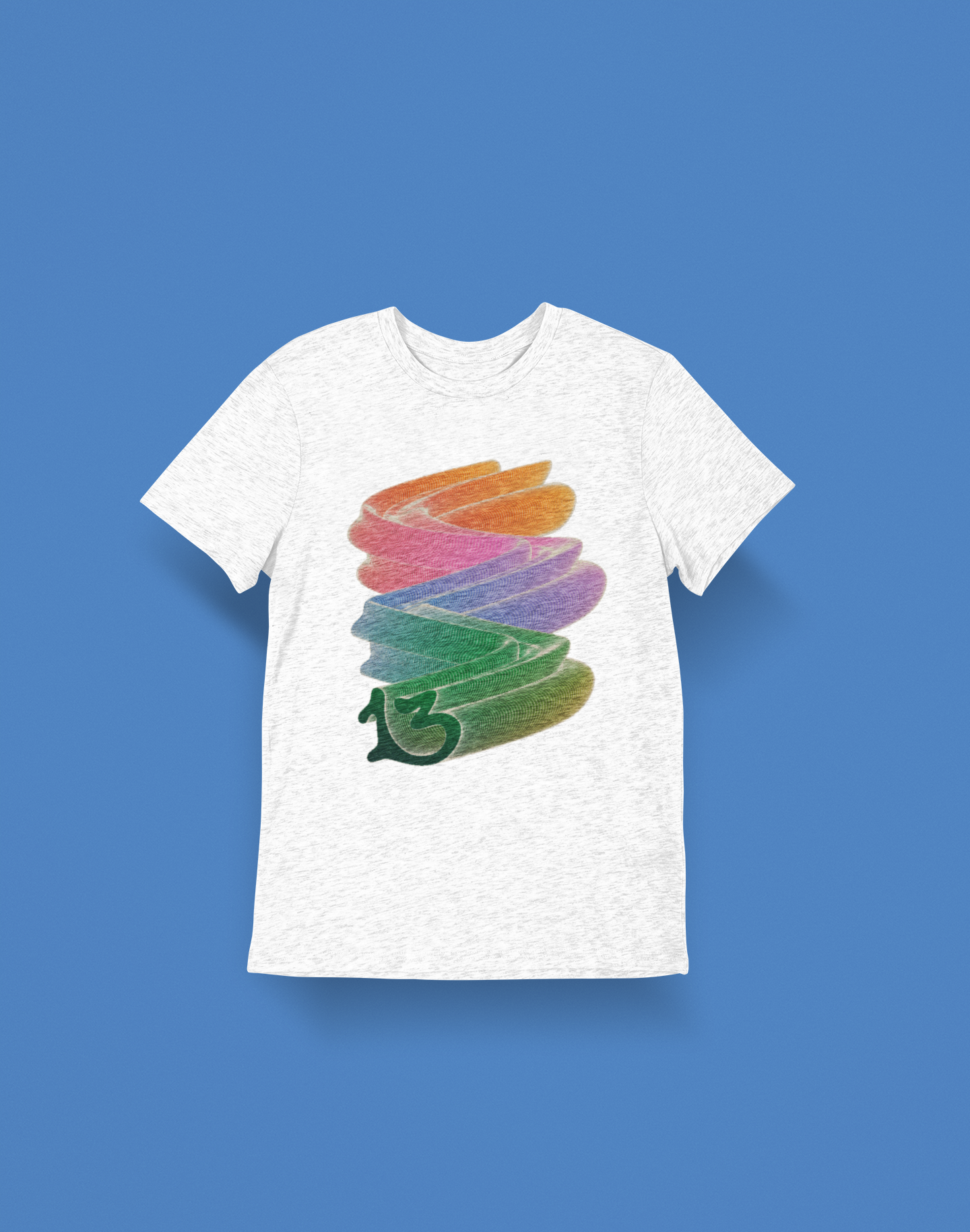
Brand Identity
Thirteen Skate Co. embodies a vibrant brand identity, characterized by bright colors and playful illustrations. Our logo, a stylized "13," cleverly represents a half pipe—a typical feature of skateboarding culture. This symbol not only pays homage to the sport but also represents the spirit of adventure and creativity that defines our brand.
Our illustrations feature lucky icons such as ladybugs and four-leaf clovers, adding a touch of fortune to our designs. With inviting typography and fun illustrations, our brand radiates joy and personality, transforming each skate session into a thrilling experience.